-
client
- Monster Energy
-
Service
- Interactive Websites
-
Technology
- HTML + SASS
- Javascript
- Websockets
- Ekko DNA
- Ekko CMS
-
Awards & Recognition
Project Background
After a successful 2015 Monster Gear program, Monster Energy again called upon EKKO Media to design and develop the 2016 Monster "Shirt Off Our Back" website. The site leverages the large, Monster Energy fan base and their connection to their high-profile athletes and engages users in a seamless, promotional experience.
The site features a highly visual responsive design that directs users to create an account, mail in their can tabs for Monster credits, after which they use those credits to purchase Monster Energy licensed apparel. The site is driven by a custom eCommerce system that was built from the ground-up to the specific requirements of the client.
Monster Personalities Driving Engagement
Monster Energy has an incredible brand following that has been built from strong brand integration in action sports, concerts and celebrity affiliations. These powerful partnerships have helped catapult the brand to make it one of the leading energy drink companies in the United States. Part of this success is attributable to how Monster engages its audience. Celebrity affiliations and targeted promotions have helped fuel this success.


A Simplified Experience
In developing a promotion, Monster had to appease their broad and complex fan base, which ranges from motocross and off-road racing to the surf, skate and music crowd. Leveraging their celebrity and sports personality affiliations, Monster developed a promotion based around a rewards program. Monster has learned that tying promotions to celebrities is a highly effective way to reach every segment of their fan base.
The promotion itself revolved around acquiring promotional codes from beverage can tabs for redemption towards merchandise. Users would gather can tabs, mail them in, then receive credits in return which could then be redeemed.

Platform and Development Frameworks
Since this was a promotion based both in the United States and in Canada, each user-group needed to be handled and tracked differently. To accomplish the required tasks, we set up a system whereby visitors from the United States were funneled to a login page where they could either log in or register for an account. They were then redirected to a page where they would print a form containing an address to which the can tabs were to be mailed. After mailing in the can tabs, users would accumulate credits in their account. Canadian users could simply enter the 10-digit code printed on the back of their can tabs to get credits instantly. It was setup this way due to varying legislation from country to country.
To accomplish these tasks seamlessly, a custom CMS and framework was needed. The framework chosen leveraged a wide range of platforms such as Angular, SASS, Websockets and what we like to call, "EKKO DNA." The DNA platform uses advanced device-detection technology to identify each user on the site, track their content consumption habits and deliver a custom experience for each user.
The site is powered by a custom CMS that closely ties their proprietary Monster Media system to the site and allows the global admins to create and push content to all any of Monster's country-specific sites. The front-end, as well as the CMS and data feeds, are running on the Amazon Web Service (AWS) architecture, with deployments in multiple data centers for imporved performance and redundancy. The content is delivered over the expansive Akamai Content Delivery Network (CDN) so that all users globally have reduced latency.
Site Design
Using an aesthetically appealing and intellectually designed framework as the basis, we were able to deliver a website that is easy-to-navigate and is highly effective at engaging users. Special emphasis was placed on consistency with other Monster Energy visuals.
In deference to the greater reliance upon mobile devices among audiences in this segment, special attention was paid to the mobile experience. Still, the powerful aesthetic elements and navigation elements had to carry over to mobile audiences in order to maintain brand consistency. This was especially critical given the historically short attention spans of users in this demographic.


Core Functionality and Features
The Monster Energy Shirt Off Our Back promotions provides its users with an easy and intuitive interface that allows for easy registration, tab credits and redemption.
All user credits are tracked individually in each account as well as through a custom CMS that give the admins of the site full controll of all fuction and features. Some of those include the following listed below.

Easy as One, Two, Three
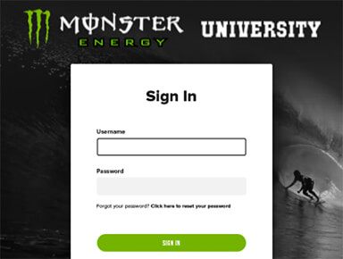
The users are quickly directed through the simple process of registering, printing their order form and mailing in their tabs to redeem for Monster Energy Gear.

User Registration
Registration is as simple as filling in a one page form. After registering the user is sent a confirmation email with a link to print their can tab mail-in form.

Classic eCommerce Experience
The unique nature of this promotion is simplified with a classic eCommerce experience. Once the user has received their mail in tab credits they can purchase products. The user pays for shipping and handling, which is processed through Authorize.net's API.
Project Outcome
High-profile athletes and celebrities create promotional interest, but once the user has reached the site, the interface and overall design are crucial. With tens of thousands of products sold, it’s clear that the new design and functionality helped drive this tremendously successful campaign.
Weeks for Delivery
Tabs Redeemed
Other Projects


